
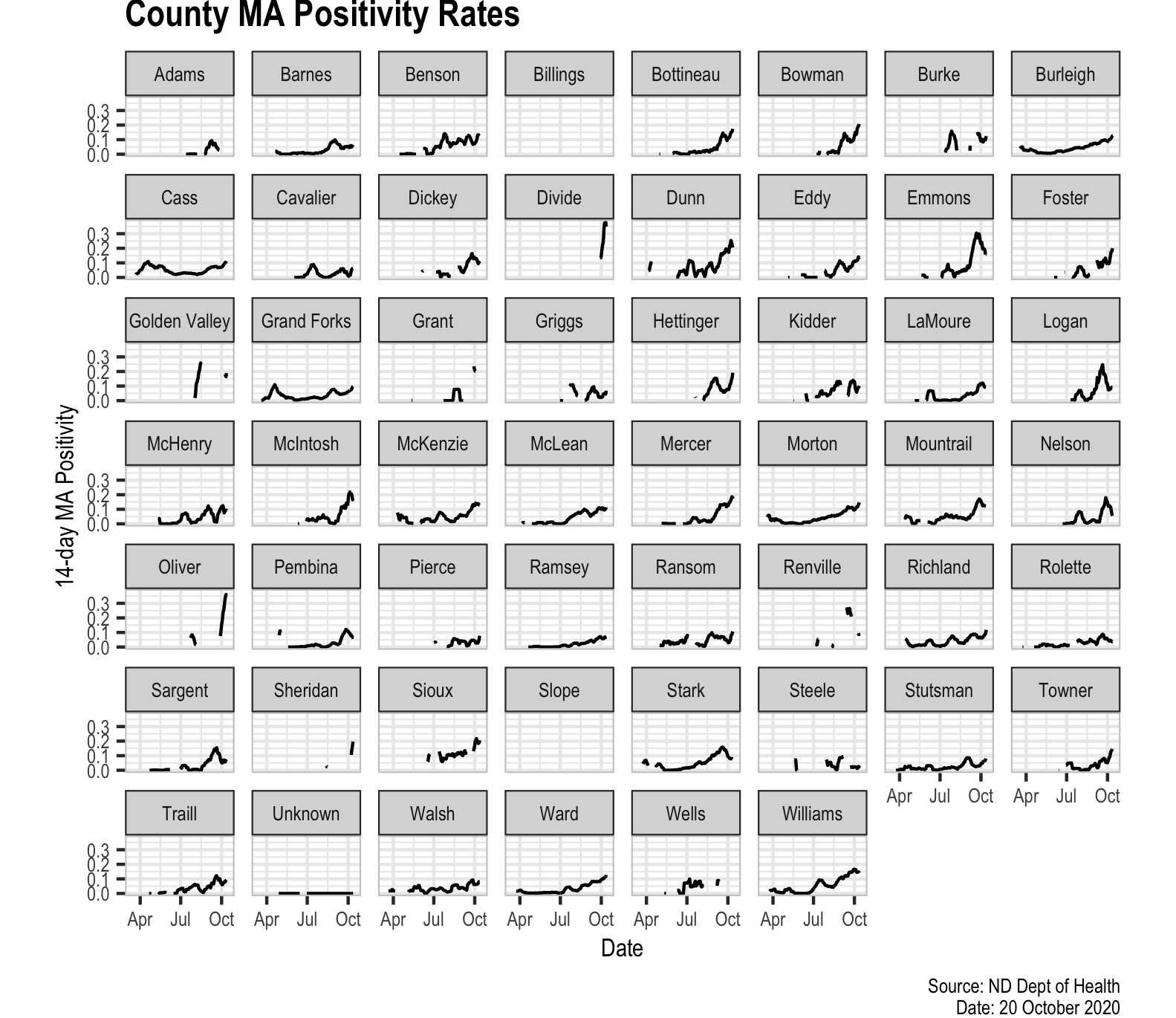
One of the things I decided to do today is to take a look at the situation across different counties. The timing of the experience with COVID clearly varies across geography and time and so there is a clear reason to disaggregate the data to inform policy. I decided to start this with the 14-day moving average of my preferred positivity rate, the positives divided by susceptible test encounters. It is a big picture so it is difficult to get the image to fit well on the website.

Clicking the link will give you the ability to download the picture. There are a few things to notice. The significant breaks for some counties are indicative of insufficient data to calculate the 14 day moving average. This would arise from zero tests in a county on a given day. I will be looking to break out interesting data for counties as the situations warrant.
